Monday, February 25, 2013
Gratitude Journal #1
- I'm grateful for all the things that my parents gave to me like my electronic stuff, the love they gave to me everyday and the care they gave to me everyday.
- I'm grateful that god always keep my family safe eveyrday.
- I'm grateful that i have good health
- I'm grateful that i have a good birthday! and that I'm safe and nothing happen to me
- I'm grateful that i wake up with a good conditions and that god didn't forget to wake me up! :)
- I'm grateful that god always keep my family safe eveyrday.
- I'm grateful that i have good health
- I'm grateful that i have a good birthday! and that I'm safe and nothing happen to me
- I'm grateful that i wake up with a good conditions and that god didn't forget to wake me up! :)
Wednesday, February 13, 2013
Typography Logos
- For Miami Heat they use Bold letters so that people
can see the words that they use and there eye catching because by the
color that they use.
- For Pittsburgh Penguins they use Italic words sop
there picture will show up more.
- For New Orleans saints they use different kind of
shape especially there sign its so unique.
- For Pittsburgh Steelers there colors really match
black and yellow, and there sign once someone said Steelers the first
thing they will think is three start yellow, red, and blue.
VIDEO GAMES:
1.
For
resident evil they use many different kind of colors to attract people and make
them interests about the game.
2.
For
The Walking Dead well this game well known as a zombies so they out many
different kind of zombies in the picture and they combine different colors just
to blend with the pictures.
3.
For
Call of Duty well this is known for military and guns so they use a guy with a
gun for boys because boys love to shoot stuff.
4.
For
Call of Duty Black ops II Well they use the same thing but this time its
different story. So that they will make the customers to even buy it.
5.
For
I am Alive they use nice graphic in this one they put the guy with a girl he’s
holding makes people wonder about what’s happening in the game.
-
For
Bench they just use the bold letters to kinda show up
-
For
Diamond Supply they use different kind of color so it will show up so people
get attracted to it and buy it
-
For
Gucci they use unique symbol that no one can ever use it
-
For
Guess just like bench they just use Bold letters so it will show up
-
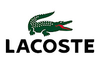
For
Lacoste they use bold letters and an alligator to show its like a nice brand
Wednesday, February 6, 2013
Typography Questions
1. In your own words, define Typography.
·
Reference: http://www.creativebloq.com/typography/what-is-typography-123652
2. What is a Serif Font?
·
Reference: http://www.webopedia.com/TERM/S/serif.html
3. What is a Sans Serif Font?
·
Reference: http://www.webopedia.com/TERM/S/sans_serif.html
4. Describe the term Leading. Why is it called Leading?
·
Reference: http://desktoppub.about.com/od/glossary/g/Leading.htm
5. What is the difference between Kerning and Tracking?
·
Reference: http://answers.yahoo.com/question/index?qid=20100107093532AAozk4X
6. Who was Johann Gutenberg?
• What is he known for?
• Where is he from?
• When did he live?
• What is he known for?
• Where is he from?
• When did he live?
·
Reference: http://www.greatsite.com/timeline-english-bible-history/gutenberg.html
7. Define these Elements of a Typeface:
• Decender
• Assender
• Bowl
• Foot
• Baseline
• Cap height
• X height
• Decender
• Assender
• Bowl
• Foot
• Baseline
• Cap height
• X height
·
Reference: https://www.google.ca/#hl=en&tbo=d&sclient=psy-ab&q=define+descender&oq=define+descender&gs_l=serp.3..0j0i30j0i8i30.2190.15247.0.15611.18.17.1.0.0.0.346.3762.0j6j9j2.17.0.les%3B..0.0...1c.1.2.serp.7SKg9kSet7A&pbx=1&bav=on.2,or.r_gc.r_pw.r_qf.&fp=cf33e01e77288d5c&biw=1024&bih=648
8. Following the traditions of typography, when is it correct to use:
• all caps?
• a bold typeface?
• an italic style typeface?
• a serif typeface?
• a sans serif typeface?
• Script or Calligraphy typefaces?
• all caps?
• a bold typeface?
• an italic style typeface?
• a serif typeface?
• a sans serif typeface?
• Script or Calligraphy typefaces?
·
Reference:
9. What is the difference between a Bitmapped font and a Postscript font?
·
Reference: http://narendra-npdezine.blogspot.ca/2011/01/what-is-difference-between-bitmap-fonts.html
ANSWERS:
1.
Typography
is where you can make different kind of pictures edit it and you can print it.
2.
Serif
font is semi-structural details on the end of some strokes and make different
kind of shape.
3.
Sans
serif font is typeface that does not have the small features.
4.
Leading
is where someone is leading you to something or lead you to somewhere.
5.
Kerning
is only between to characters and tracking is the spacing between letters in an entire
group or paragraph of text.
6.
He
was known for making the first printer, he was born in Germany and he live in the German city of
Mainz.
7.
Decender – it’s a part of a letter that extends below the level of its base
Assender- A person or thing that ascends.
Bowl – it’s a ball usually made
of composition material and slightly asymmetrical so that it runs on a curved course.
Foot - The lower extremity of the leg below the ankle.
Baseline – it’s a minimum starting point used for comparisons
Cap height - cap height refers to the height of a capital letter
above the baseline.
X height - the x-height or corpus size refers to the distance
between the baseline and the mean line.
8.
You
only use caps when you needed it, you use bold is when you want to see the word
in your picture,
9.
The benefit of Truetype
fonts is that all versions of Windows support TrueType fonts as a standard.
PostScript font technology makes it possible to scale fonts. Postscript’s
Scalability option allows all point sizes from that font to be created without
losing any font quality.
Tuesday, February 5, 2013
Subscribe to:
Comments (Atom)


